Building Recognition
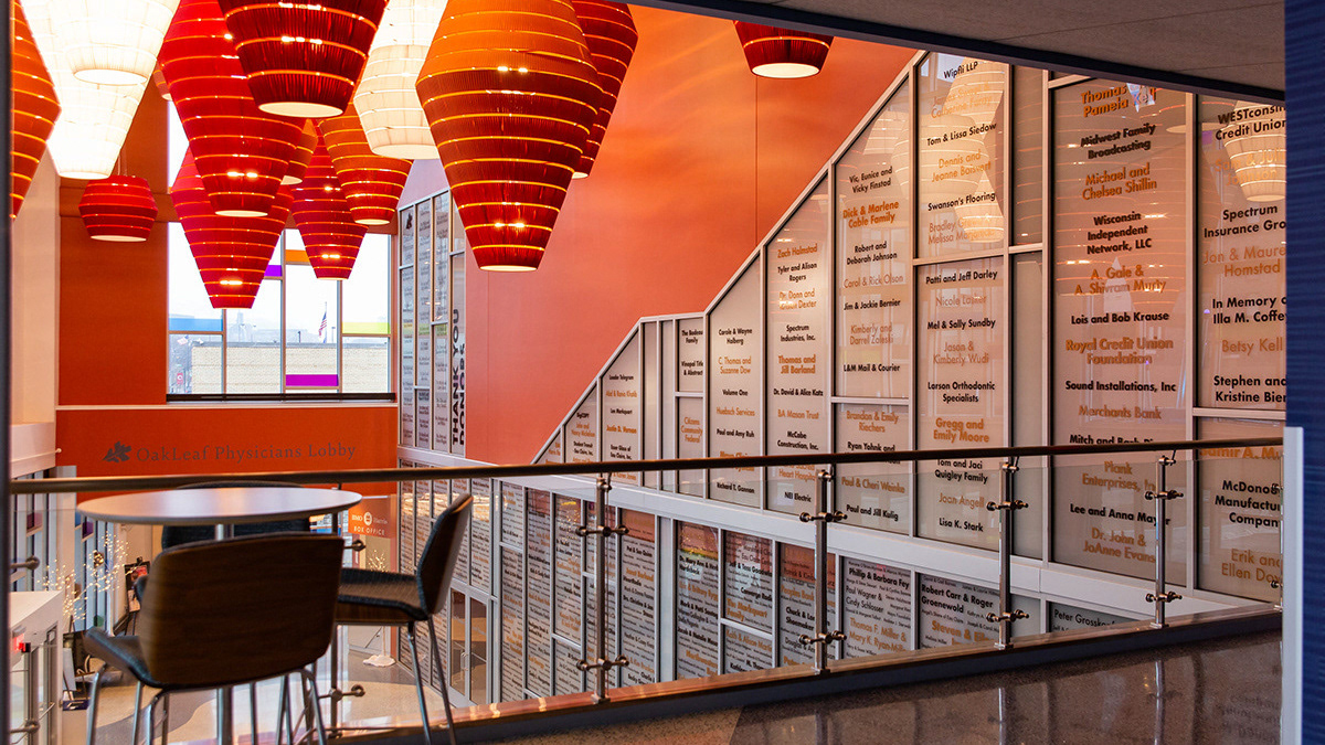
Designed an oversized donor wall for the Pablo Center at the Confluence, transforming it into impactful environmental graphics that honor the supporters who helped bring the center to life.
CVTC Snapshots
I captured authentic images of CVTC students, staff, faculty, and campus events to showcase the dynamic student experience and highlight specific programs. These photos bring campus life to the forefront in web and marketing materials, giving a vibrant and genuine look into CVTC’s community.
Balance Transfer - RCU
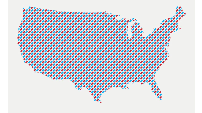
Developed a multi-channel marketing campaign for RCU by capturing impactful photography and designing a suite of marketing assets, including posters, print ads, mobile ads, and billboards. This cohesive campaign strengthened brand visibility and engagement across digital and physical platforms.
CVTC Socials
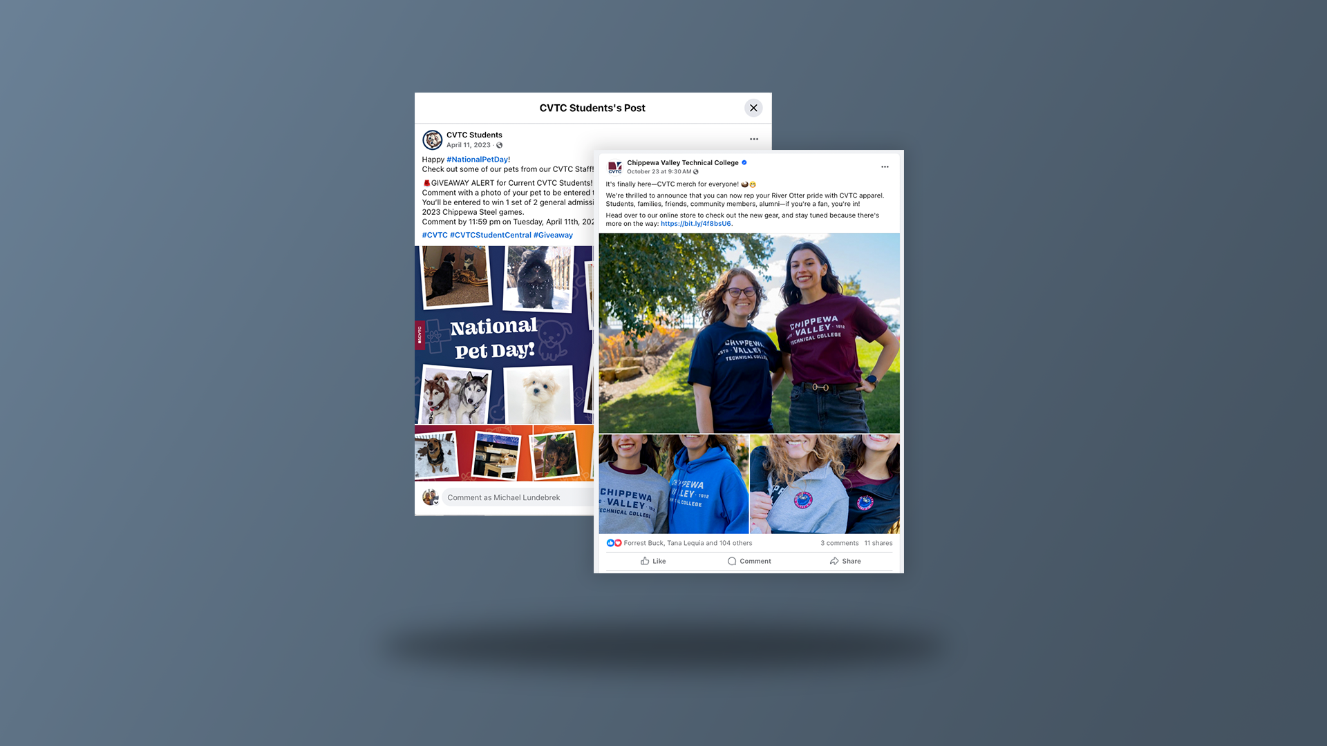
Faced with the challenge of maintaining consistent, high-quality social media engagement across CVTC’s main Facebook and CVTC Student accounts, I collaborated closely with the social media team to help create a cohesive posting strategy. By establishing a structured schedule and using Sensible to streamline approvals, we tackled the issue of inconsistent posting and ensured each piece of content was timely, on-brand, and resonated with our target audiences. This proactive approach allowed us to boost engagement, effectively communicate key messages, and maintain a unified voice across both accounts.
ECYC Brand Refresh
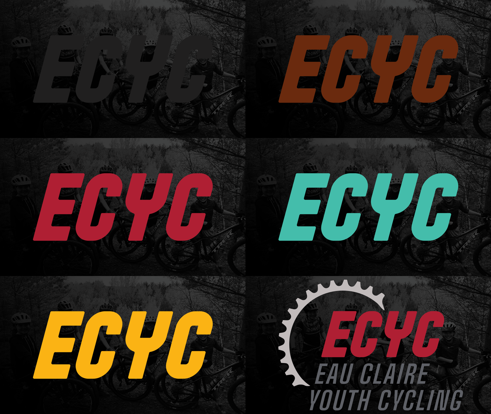
When Eau Claire Youth Cycling needed a more cohesive and recognizable brand to strengthen its community presence, I took on the challenge by revitalizing their visual identity. I refreshed their logo, updated their color schemes, and established clear typographic guidelines. To ensure consistency, I developed a comprehensive brand sheet, empowering them to create unified marketing materials and branded items. This approach helped boost the organization’s visibility and reinforced its connection with the local community.
CVTC Program Shots
Captured dynamic images of CVTC’s programs to visually showcase the student experience across various disciplines. These photos are featured in print, web, digital, and social media to give prospective students an authentic glimpse into campus life and what it looks like to enroll in each program.
Prairie Ridge Early Learning
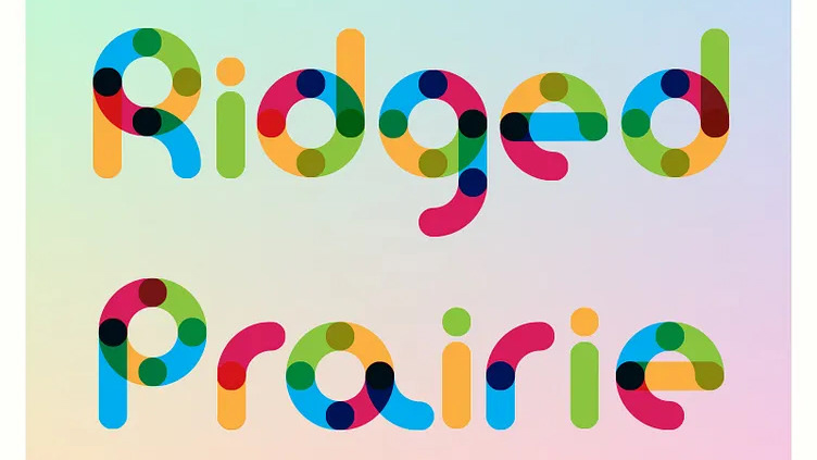
Designed a logo for Prairie Ridge Early Learning Center that embodies a nurturing and welcoming atmosphere. This brand identity uses soft visuals and warm, nature-inspired colors to resonate with young learners and their families, enhancing the center’s role within the ECASD community.
Kristo Ads
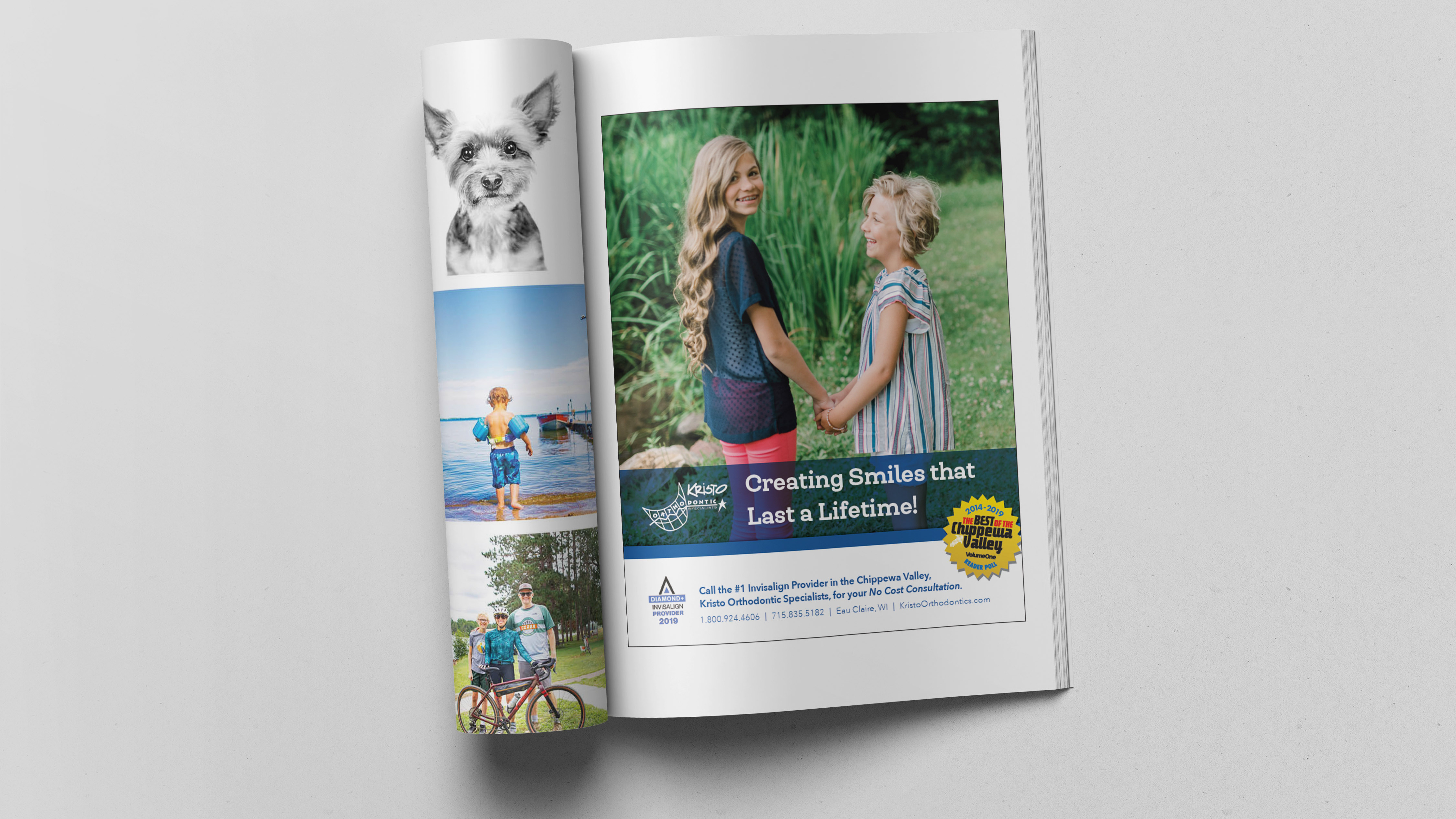
Collaborated with Kristo Orthodontics to develop targeted print and digital ads aimed at engaging both kids and adults. Focused on crafting approachable and visually appealing concepts to broaden brand reach and connect with diverse audiences.
ASTI Rebrand
For the ASTI Salon Systems rebrand, I was tasked with updating a logo originally created in the early 90s and bringing a fresh look to both their branding and packaging. I crafted a custom type logo designed for versatility across multiple applications. Once the brand identity was established, I redesigned the packaging to stand out against competitors, creating a look that balances boldness and elegance, ensuring ASTI’s products make a memorable impression.
Northwoods Elementary
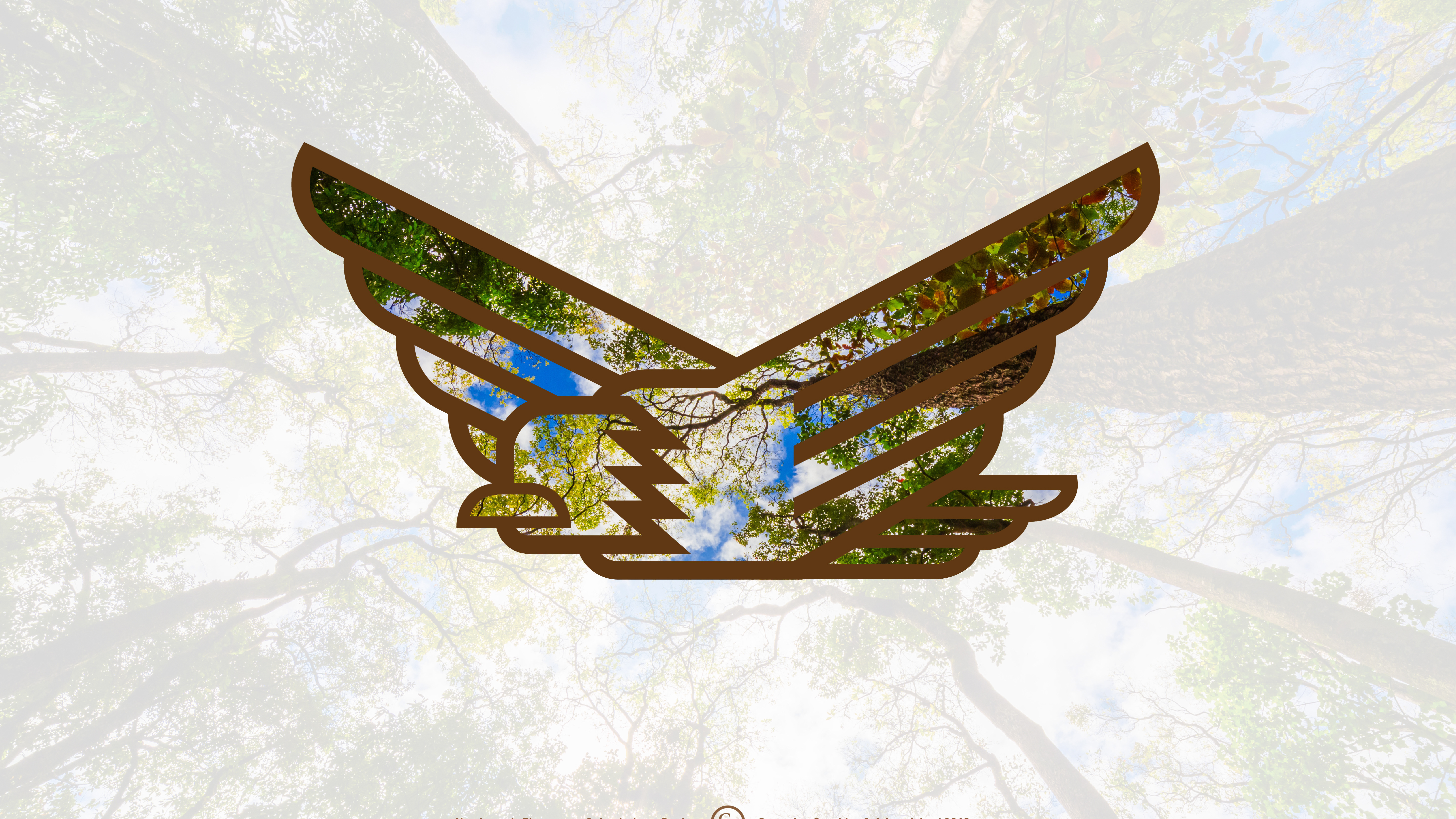
Rebranded Northwoods Elementary School to create a cohesive visual identity that reflects the school’s values and natural surroundings. This refreshed logo strengthens community pride and provides a unified brand presence that resonates with students, families, and staff.
ECYC Snapshots
Captured dynamic images for Eau Claire Youth Cycling, showcasing the team spirit and confidence-building aspect of youth cycling to support web and marketing efforts.
Longfellow Elementary
Rebranded Longfellow Elementary's lion mascot to modernize its identity while honoring its legacy, creating a friendly, cohesive look that unites the school’s heritage with the district's branding.
Ganther & Associates Branding
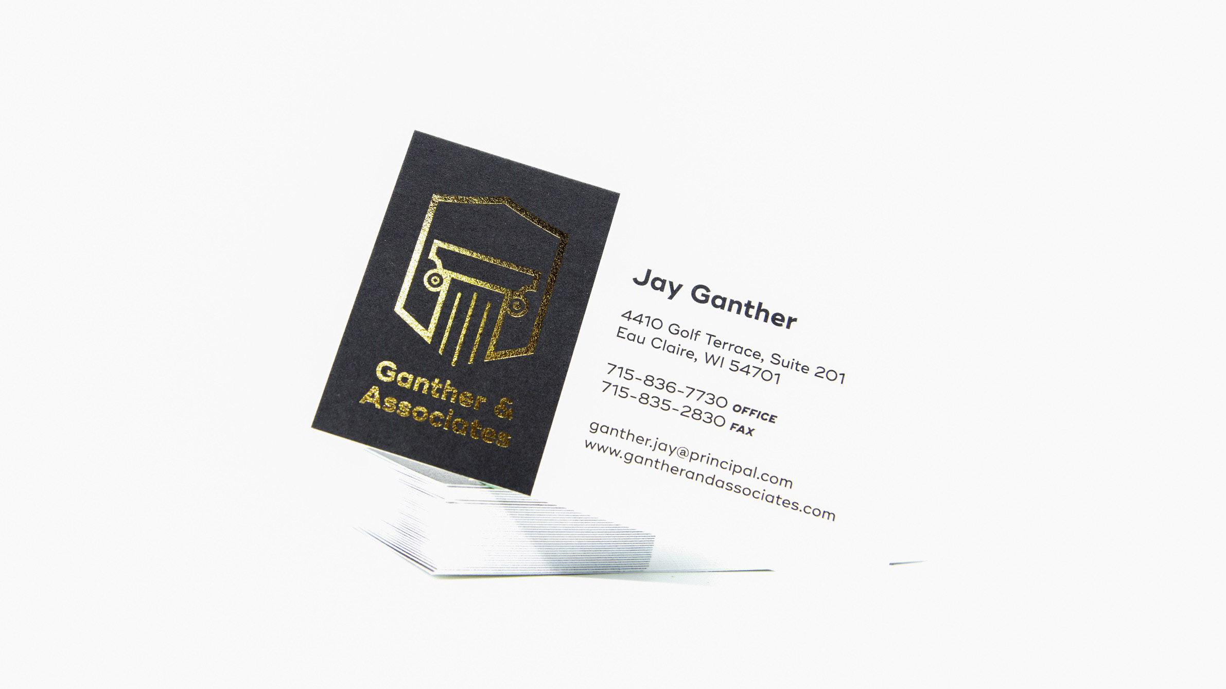
For Ganther and Associates, I developed a branding identity that embodies tradition, trust, and an established presence. The final print pieces use gold foil on rich black marble paper, adding a sophisticated touch that reinforces the firm’s professional image and makes a memorable impact.
Tanner Excavation
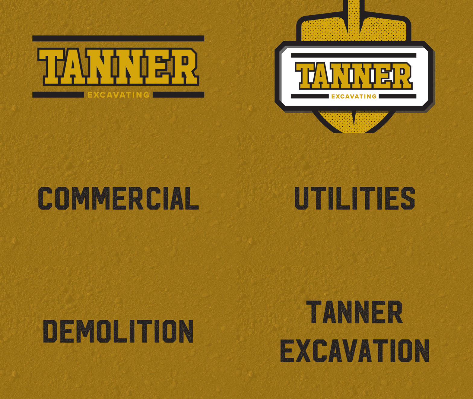
Created a bold, durable logo and brand identity for Tanner Excavation, ensuring high visibility and seamless application on heavy equipment and trucks. The design strengthens brand recognition in the field and captures the company's robust, hardworking spirit.
Offline
When I’m offline, you’ll find me in the Northwoods or out on my bike, recharging away from emails and screen time. In those moments, it’s all about finding inspiration from nature, taking in the quiet or the trail ahead, and bringing that focus and clarity back into my work.